Since late last night, I have been playing around with color families and wash effects on Zentangles, as suggested for Days 22 and 23 in one Zentangle a Day. Per the book’s suggestion, I tried some white Gelly Roll pen figures with a watercolor wash over them. But either I have the wrong kind of Gelly Roll, or I have used too much water to wet my tile. The results keep washing out the gel ink so that the design won’t show through the paint. Or maybe my colors are not deep enough? Maybe. But I have given up on watercolor for now and am attempting a wash effect using colored pencils.
Another recommendation is to create color wheels of warm and cool versions of primary colors. Until a few years ago, I thought warm colors were reds, yellows, and oranges; while cool colors were blues, greens, and purples. It was a real eye opener to learn that reds can be warmer or cooler, as can blues and yellows. It only follows that there are warm and cool versions of all the primary colors. So I got out paints and color pencils today and organized them by color family so I wouldn’t accidentally pair a warm red with a cool blue (which results in a really muddy looking purple).
Next, I set about experimenting with wash effects using color pencils, since I was an utter failure at using watercolor washes on my tangling tiles. That was another long process as I experimented with wax-based and water-soluble pencils over white gel pen as well as the black Micron pens. Getting color “right” over graphite shading was another challenge. Finally, I seemed to get the effect I wanted without mess, using my Prismacolor Premier pencils. I was ready to add color to my tile.
One thing that is generally recommended is not to used colored pencil over graphite shading. I have read that in several drawing books by as many authors. Of course, I always have to experiment just so I can see for myself why graphite pencil is a no-no with color pencils. (OK. I had done this before, but I needed a refresher.) Here is the tile I started out with, complete with #2B graphite pencil shading, just as I would do for a tile that ends there.

Above is the tile which later received a color pencil upgrade. Using a cool color pallet, this is the result.
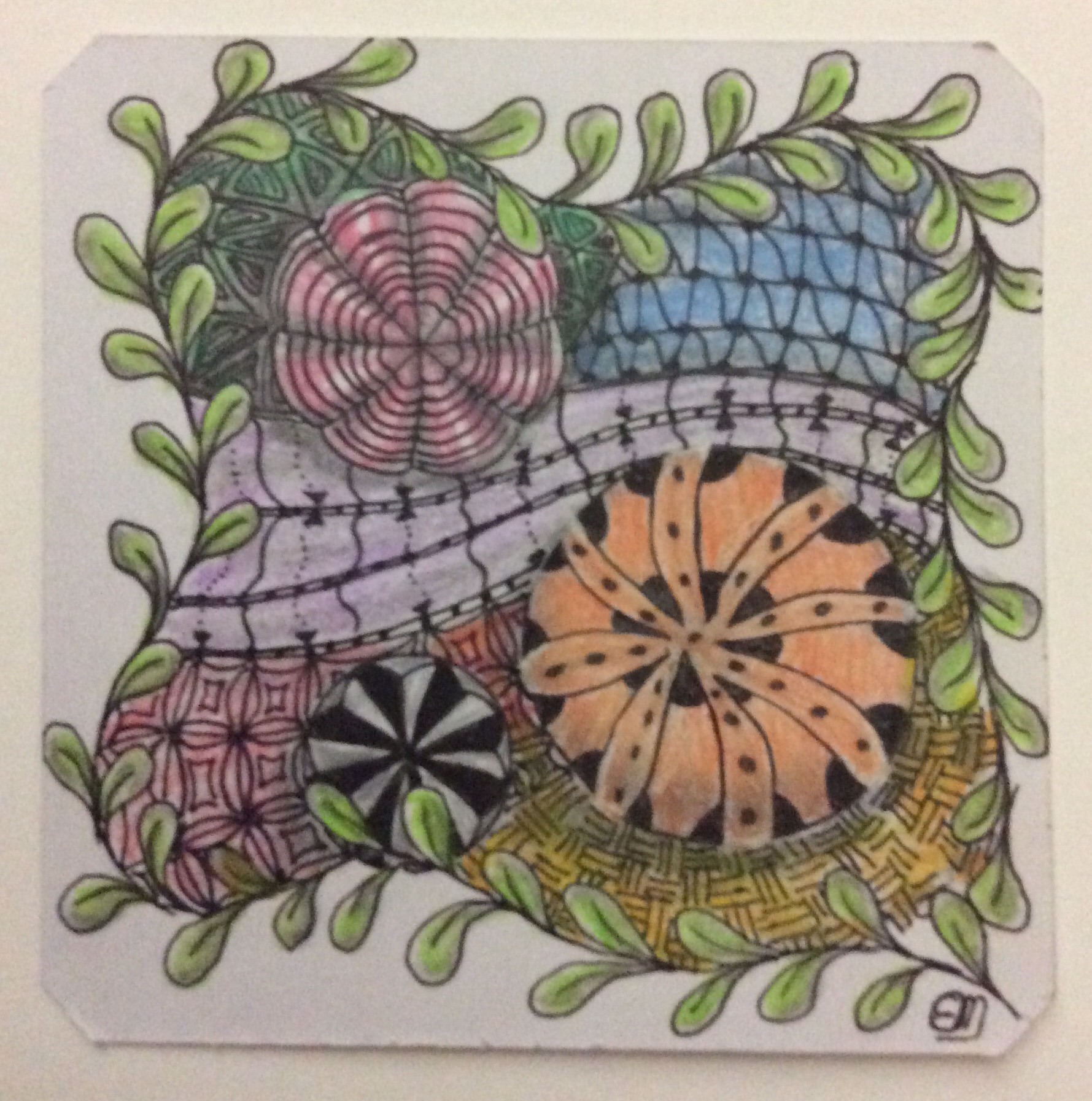
Because of the graphite underneath, I didn’t blend the color pencil out. If I could get fixative here on the island, I would have sprayed between monochrome and color application. Without the fixative, I was afraid the graphite would become so smudged that everything would look gray anyway. At least this way, the graphite shading comes through without destroying both the color wash effect and the tangle.
Overall, the color application does resemble a watercolor wash to some extent. Unfortunately, because I couldn’t blend, there are no color transition areas–there’s only the the area where one color ends and the next abruptly begins. Oh, well. I can’t have everything the first time.
Transitions is a topic I have discussed several times before. I think of transitions as turning wheels, like on a watershed.
In the case of the tile, the transitions for me are between a strictly monochrome pallet of white, black, and grays, to the addition of primary and secondary color; and moving from just pen and graphite pencil into the world of color pencils for tangling. Both are bigger deals than they appear. Color application takes time to learn to do well. As a kid, I used to love the Venus Paradise color-by-number sets. The pencils were of a far better quality than most color pencil sets designed for kids, especially in vibrancy. But even back then, I hated that one color ended and another just began. Even when I was very young, I knew that colors shift and meld together in real life. Even an apple doesn’t have a drastic color change between the red and green. And yet, here I am back to coloring in blocks without transition–except for the boundaries of different Zentangle patterns.
In recent years, I have been going through a lot of personal transitions–moving to a non-American island in the Caribbean, officially retiring, changing homes on the island, saying goodbye to pets and adopting new ones, and a bunch of other things. When I was younger, transitions were much easier. Now, it takes longer to adjust, longer to do everyday tasks, harder to do things I never had to think about as little as five years ago. It took longer than expected to fully adjust, but I got through.
We all go through transitions of one type or another more often than we want to think about. Some are easier than others. Those that are initiated by something or someone outside of ourselves, and over which we have little or no input and control, are the hardest to deal with. If you know someone who is going through a transition, remember to be kind to them, especially if you know they are having difficulty adjusting. When a person feels a situation is out of their control, they are liable to undergo a temporary character or behavioral change for the worse. That’s probably a coping mechanism of some sort that helps them get through the day. Remember that, for many people, even relatively minor changes that others see as normal may be overwhelming. Your understanding could go a long way toward helping them adjust better and faster.
Right now, I can handle a transition of artistic media, even if I have to substitute one “try this” for another. Thankfully, I still love experimenting.
Keep those color wheels turning.
Happy tangling!
##
#educ_dr


Try the watercolor wash and dry thoroughly before adding your gel pen. Gel ink is water soluble which is nice if you decide to use it for shading. Just use a slightly wet brush to smooth out the color (glitter pens will spread the glitter in this way as well). I like this tile!
Thanks for the advice! I will try that soon.
Thanks for liking my tile, as well. 😊
Reblogged this on Still Another Photoblog.
Thank you!
You are welcome!