Is It a Plan?

Day 25 in One Zentangle a Day presents one official Zentangle enhancement called perfs and a tangleation on Tagh called Taghpodz, created by one of the book’s contributors. Perfs are an ancient device used by Illuminators to call attention to an aspect of their illuminations or to decorate an illuminated letter. As for the tangleation Taghpodz, I can’t help wondering when a tangleation becomes an official pattern. Maybe when enough people start to use it in their work? 

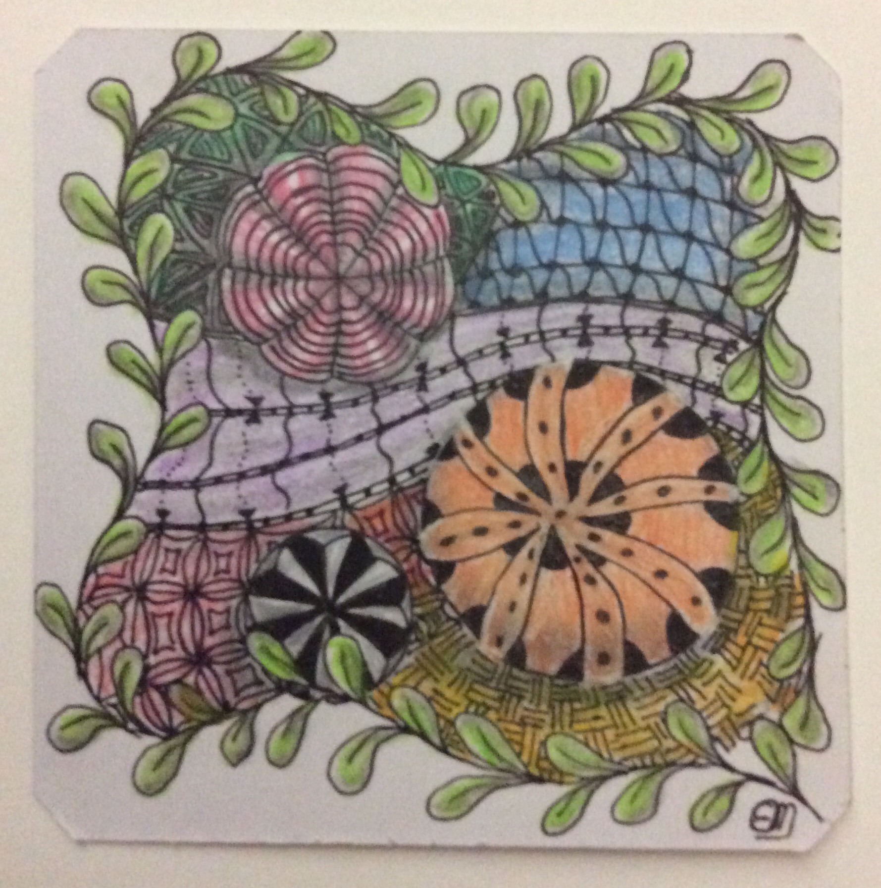
The author provided an example tangle that caught my eye (see featured image), and I have been playing with it all day yesterday and today. One element modified the pattern Gneiss and placed Taghpodz into its “arms,” making the element look like a fancy folded handkerchief or a flower. I decided to plan my tangle in my sketchbook using only pencil, as I knew ink mistakes would drive me nuts. Then I started adding shading to the graphite drawing and almost destroyed my plan. Here is what I pretty much ended up with–all in graphite, with a note to fill in an area that was just too repetitive for the “plan.” I put plan in quotes because I have an almost complete tangle (except for that one area). 


When the tangle is re-drawn in ink on a tile, a bit of color will be added, followed by a wash to fill in the spaces. I added perfs to highlight the Poke Leaf motif, and used Taghpodz in the flower petals. The shading was stopped when the underlying design started to smear or vanish under the application of the tortellion (not sure about the spelling). I wanted a working, detailed plan to follow, not a distorted rough sketch. I wanted to test perspective and details without worrying about getting a final product on a first run. I may have gotten too detailed for a draft, but this is just a practice run. After a few attempts at changing perspective details, I will be ready to make a permanent ink and watercolor copy of this plan or a similar update. For now, the drawing remains a plan.

Unlike professional artists or Zentangle masters, it takes me hours to create a Zentangle or ZIA (Zentangle Inspired Art), especially in ink. This graphite version took me several hours, including erasures and re-draws. That much time for a draft must mean I am either doing something wrong, or I am learning an art form that is not right for me. I read somewhere–possibly in this book–that anyone should be able to complete a tangle in about a half hour. I wonder how many years I will need to practice before I am that fast? 

Admittedly, part of my problem is that I am challenged, physically as well as temperamentally. The hand tremors add to the temperament, and the result is frustration. Since I can draw a straighter line quickly than if I take my time, that is what I do. But when it comes to curves, all bets are off. Why do I keep at it when it is so frustrating? Well, I started for the meditation aspect of the work. Within weeks, I realized that I would get no meditating done for some time. 

Why do I continue? I continue because I there are artistic elements that I have learned from this book that I have had trouble learning from other sources, including a live instructor. Also, there are things in the book that make me wonder enough about the source or the rest of the explanation that I have taken the time to investigate or think seriously about. The meditation aspect may not be coming yet, but other valuable thoughts and ideas have come instead. So, I continue. 

There are aspects of this book which I will probably never attempt–or not for a long time, anyway. For example, today’s lesson goes on to introduce, and encourage the use of, gouache. I don’t know if the art shops on the island stock gouache, which is thicker in texture and more opaque than watercolor (according to the book). I also don’t know if I want to invest in a new art medium at this point. Another medium introduced is alcohol markers. Good ones are extremely expensive, and all I can afford right now is the basic 4-piece set. The price of these is high enough on Amazon, and I don’t think I want to know how much the local shops would charge, assuming they stock them at all, or would be willing to order some. This is, after all, a tourist industry island, and local artists tend to stick to the stand-bys of oil, acrylic, and watercolor paints and supplies. The shops also stock clay and inks, but stay away from less traditional materials. So I need to plan very far ahead if I want to experiment with another medium. There is only so much I can carry back in my suitcase from my annual trip “home.”

Planning and frugality of resources is part of life for me now in a way I never had to worry about in the past–when I lived in the States. I had become used to shopping for anything any time. Price comparisons was a way of life to save money. Not any more. Shopping is a planned activity, and waiting for months until something is once more in stock is the way things work on the island. Prices on everything except booze, tobacco, cameras, and jewelry are “full”–no bargains or regular sales here. I almost feel like a frontierswoman waiting for the tinker or sundry wagon to make its annual trip to town.

The island has been, and continues to be, an adventure and ongoing learning experience–much like learning the art of tangling. There always needs to be a plan…

Happy tangling!

##

#educ_dr

Posted in Art, meditation, Zentangle | Tagged , , , , , | 4 Comments

Mystery Writer’s Tool

Do you write murder mysteries?.

Here is a Good tool for mystery writers provided by Don Massenzio ‘s blog.

Mr. Massenzio is a mystery writer and an excellent source of reviews on new and old books, especially mysteries, I think. The book, Stiff, is non-fiction, but gets Don’s approval for both content and style. 

Yeah. It’s a lazy kind of day today and I have been avoiding both blogging and creation. It’s the weather here on the island, I think…

##

#educ_dr

Posted in Writing process | 5 Comments

Third Party Politics

Posted in Writing process | Leave a comment

Blogging Fundamentals: Day 5

This post is part of the blogging fundamentals tutorial offered by WordPress. If you are a regular follower of my blog, you are probably not interested in this path. I will try to remember to title all related posts with Blogging Fundaments so you can recognize and skip them.

It’s Day 5, and I am directed to check out various themes and try an assortment of customizations. Well, I didn’t want to play with this site–did that once before and didn’t recognize my own site!–so I tried another of my sites that I started some time ago. I hadn’t done anything more than post a “first post,” so there was Little that could go wrong. 

There are fewer free themes than there were a year and a half ago. With some of the free themes, there is almost nothing to customize except some of the available menus, color schemes with very limited assortments, header photo, and fonts. I played with a few choices, and made a change or two. It seems like the good customizations come with the themes you buy. Oh, well. Assignment completed. And this site remains intact. That’s the best part, even though I know I will make a few changes in the near future. 

Not much to report today, except that I did have some fun with the customizations. 

Happy blogging!

##

#educ_dr

Posted in Blogging Fundamentals | Tagged , , , | 6 Comments

Made for Shade

While shading a tangle in my sketchbook, I realized I grabbed the wrong pencil for the task. As I learned when I first took up drawing, not all pencils are created equal. How the wrong 2B pencil–oh, wait! It’s a 3B!–got into my standard supplies box, I may never know. It will soon end up in the trash or used for other tasks. 

Back to the topic, there is so much variation among companies in their interpretation of softness or hardness of graphite pencils. 

Three wood encased pencils and a generic insert stick for a clutch pencil are shown in this picture. The Castle pencil, which I thought was a lighter 2B, turned out to be 3B! I didn’t want to look for its 2B sibling (if I still have it), but left it with the other 2Bs for comparison. It is incredible how the different companies interpret 2B. There is probably as much variation in all hardnesses. Not only the color, but the blend ability itself is different from one brand to another. 

Why am I looking at 2B pencils? Because the recommended brand is not included in One Zentangle a Day. Only a 2B pencil is listed in the materials list. Since I immediately saw a difference in the tone of the shading (I had picked up the Lyra Art Design), it was time for another assessment of my supplies, as I had clearly decided, on a subconscious level,which pencils were not suitable for my tangling. 

The shading started out with a Lyra 2B pencil, but refreshed and finished with the 2B Derwent, which gives a better contrast.


Since I am a novice, I managed to accumulate a number of “test implements.” When I first started, I bought several sets of graphite pencils in a variety of price ranges and from as many manufacturers. I compared and contrasted pencil brands and tone right away. As I gained experience, favorites emerged. For 2B, my favorite is the Derwent Graphig. My very favorite sketching pencil is Prismacolor’s Ebony Stick. But the ebony is too dark and rough-textured, I think, for Zentangle shading; so the Derwent became my Zentangle choice, even though it is rougher in texture than the Lyra (which is readily available at the local art shop). Although I prefer Lyra’s smoothness, it is simply too light for me to work with. Eventually I will probably select a different brand that I like even better. For now, materials are purchased on a “let me try something new” or a full-replacement basis only. 

The variability in the characteristics of the graphite resembles the variability among cultures as well as individuals within a culture. No two “brands” or “generations” (think material manufacturing runs) are exactly the same. Each culture is unique; each person, though sharing cultural mores and customs, is as unique as his or her neighbor. Within cultures, there is always an individual whose behaviors or ideas appear more similar to someone from a starkly contrasting culture. We really can’t guess whether a person of Chinese heritage is more like us or less until we have gotten to know that person, and gotten to know what we mean by “like me.” Because we perceive others through our own learned biases, it is often long after we are friends that we can separate out the “Chinese” from the unique individual. Only then do we perceive the commonalities of thought, experience, and worldview from the more apparent characteristics of eye shape, skin color, and other culturally specific outward characteristics. Sometimes, a 3B is more like a 2B, as with the Castle pencil.

I prefer the smoothness of the Lyra Art Design graphite 2B pencil, but prefer the tone of the Derwent. Maybe the next time I make a purchase, the results of the newer manufacturing runs will reverse my preference. Maybe I will find a brand or brand line that I like better. Either way, there are characteristics that I can appreciate in the pencils I have at hand. And isn’t appreciation what friendship is all about?

Happy Tangling!

##

#educ_dr

Posted in Art, Zentangle | Tagged , , , , | Leave a comment

Blogging Fundamentals: Day 4

This post is part of the blogging fundamentals tutorial offered by WordPress. If you are a regular follower of my blog, you are probably not interested in this path. I will try to remember to title all related posts with Blogging Fundaments so you can recognize and skip them.

Day 4 and the tutorial continues with the directions below.

Today, publish a post you’d like your ideal reader to see, and include a new-to-you element.Here’s how:

First, brainstorm the kind of person you hope will read your blog. What do you want to say to them?

Next, start your new post by clicking on the button below. Remember to include a media element (an image, a video embed, etc.) you haven’t experimented with yet.

Finally, give your post a few tags, including bloggingfundamentals, and publish it.

Writing with a specific person in mind is a great way to focus your thoughts and goals. Exploring new media elements adds more tools to your storyteller’s toolbox and helps engage your readers.

So… Audience and media. 

The perfect reader of my blog…

To whom, exactly, am I writing? It is not something I have thought about too much lately. A few of these tutorials back, I was pretty proud of myself for identifying what I want this blog to be about. Somehow, I thought of the blog as being my thoughts on the two topics of aging and writing. Both are processes. Both are important to me. So I started this blog site with the idea that I would be writing mostly for myself. Audience was incidental. 

And now I have added the relationship of drawing and writing as complementary art forms… For a while, at least.

But what is the purpose of blogging if the site is used more as a personal journal than as part of a discussion with others? Even if people don’t comment on or respond to the topic of the day in the comments section, they might think about what was said and create their own meaning, or incorporate what I wrote into their own worldview. The best I would hope for is that the reader would think about what is written here. 

That doesn’t answer the question of who my ideal reader is. Let me think on that…

And the media element… 

Some time ago I learned that 1) readership increases if the post includes an image (especially a featured image); 2) including more than 3 links may cause others’ security protocols to reject your post from inclusion to their Readers–and even from notifications of posts–because much spam contains more than three links; 3) if a blogger has slow or limited internet service, featuring an embedded video may tie up their systems and you will lose a potential follower; 4) large pictures (in MB) have the same effect on a reader as embedded videos. 

Also, if your site contains a pop-up window that basically forces a viewer to register for your newsletter or as a follower, it is difficult to “like” a post, or even read it, without changing one’s options and/or security settings. Often, the pop-ups make reading a post difficult, and large pop-ups block everything. Personally, I have stopped reading blogs I follow that started including any of these options. I was always security conscious, and living on an island where pirating is de rigeur makes security an even bigger concern. Well, at least their views counter increments.

Another thing you won’t find on my blog site is one of those sliding Windows (I don’t have the name for them) that provide sharing options or other features. There is one blogger whom I have been following for quite a while. Recently, he added this option on his posts. On mobile devices, the WP apps don’t let you suppress these. The windows don’t stop you from liking or commenting, but they are not transparent so they remove a strip of the post from easy visibility. You can move the page up and down so you can read the whole line of text, but it’s a nuisance. Many of his posts don’t get read if I am using a mobile. 

Because our best internet connections are slower than what we are used to, anything that ties up internet resources or my ability to read a post gets skipped. Since I have a pretty long list of blogs I follow, I simply ignore these blogs and move on to the next item in my Reader.

WordPress provides lots of sophisticated do-dads to lend interest to blogs. What the reader experiences may not fit with the level of interest in your site. 

Bottom line: Keep it simple. 

Wrap-up

The post to my ideal reader will have to wait for a while. It will take me longer than one day to determine a fixed audience, especially since this site undergoes changes of focus as I pursue different types of topics. I try to keep posts over time consistent within a time frame, but topics change as I move on. One thing that does not change is that I continue to experiment with written forms.  I think about how I am writing–or, more likely, how I wrote the last post. 

On media elements, I will stick to pictures that do not take too long to load. If I find elements too intrusive, chances are pretty good that others will feel the same.

As to tagging, I tag each post based on its individual topics. As an example, in my current regular posts, I am working through learning to create Zentangles using a how-to book. I always include the book title as one of my tags. When I am done with the book, I will drop that tag. With this strand of posts, when I move on to the next tutorial, the bloggingfundamentals tag will be retired. We all grow. Growth means that focus changes, sometimes a little, sometimes a lot. I have been blogging long enough to be aware of the changes.

(Note to self: Keep it short. Simplify! Practice!)

Until the next lesson post, Happy Blogging!

##

#educ_dr

Posted in Blogging Fundamentals, Writing process | Tagged , , | 5 Comments

Tropical Depression

I live in the tropics. It has been a disappointing day. It’s a tropical depression. 

Thank goodness tropical depressions don’t last long–just long enough to regret a Zentangle. 

It’s Day 24 in One Zentangle a Day. Today’s new tangle patterns are Striping and a tangleation of Pepper. Except that the tangleation looks less like Pepper and more like Zinger. But the author was taught the Pepper Tangleation by one of the founders of Zentangle, so who am I to say? Today, besides the new tangle motifs, the lesson discussed combining ink and watercolor. So basically, the work should have watercolor over the drawing, and then a thicker black pen is used to emphasize areas of the tangle. 

Today, I would not make the mistake of shading my tile with graphite pencil before adding watercolor. Today, I would shade with Koi gray watercolor brushes. 

After drawing my string, I drew tangle patterns with the 01 Micron pen. As usual, some lines are clearly shaky, as I didn’t use a ruler or French curve to guide my hand and pen. I was almost finished filling in the black parts of the tangle when my pen nib dried out–or the pen ran out of ink for a little while, maybe from an air bubble or something. (Here on the island, it is best not to leave ink pens out for any length of time as they tend to get leaky very quickly. That’s also, apparently, when air bubbles get into the pen.) I grabbed a different pen from my pencil box–a Pilot Precise V5 that I often use for practice in my sketchbook–and finished up. Only then did I think about the new pen’s colorfastness. Testing it with water on scrap paper, sure enough it ran a bit. Not much, but just enough where it ran into the water a bit. The pen mark remained sharp, but the water turned gray. Not good. Oh, well. I would work around that problem.


Next, I grabbed a watercolor pen in the lightest gray and shaded my tangle. Of course, the brush slipped once or twice, so I guess my hand shook. After letting it dry, it was obvious I also needed a darker gray in the nooks and crannies. So I added more shading with the medium gray.


Before I added regular watercolor, I thought I should let the grays dry thoroughly. To me, the tangle was finished. It could have used more shading, I suspect, but I was fearful that I would mess it up more. 

Once the grays were dry, I used straight watercolor paint to tint the tangled “flowers.” Next step: a watercolor wash. Now I was getting nervous, as I am just not crazy about watercolor washes. I never get them right, and always manage to mess up a perfectly good piece of work. While the flowers were drying, I thought about my options and went to the dentist’s. Just for a cleaning–no root canal work or anything drastic.

As luck would have it, the power outages we had today (and probably those of the past several days) messed up the community’s electronic gate. I had to back up a quarter of the road to turn around to go out the entrance (one-way drive), no easy feat when your spine is crunched up with arthritis. That took ten minutes and got me on the road just late enough to get into a traffic jam. On an island only 17 miles wide that doesn’t sound like a problem, especially since one is going only 5 kilometers into the main city of another country (I love this island!). But there are five round-abouts between my home and the dentist, and plenty of tourists trying to negotiate them. A ten-minute leisurely drive can turn into a frantic 30-minute stop-and-go race in moments. The gate incident messed up my timing by just enough to make me late. But it gave me plenty of time to think about my watercolor wash problem. 

An hour later, I was home and the watercolor applied earlier was dry. One thing about watercolors–once the paint is dry, it is pretty much permanent. That’s why a wash can be applied over a painting with little fear. That fact does not make me braver in the face of watercolor washes, though. I still cringe whenever I need to apply one. And the fact that the second pen’s ink smears when exposed to water didn’t help me feel more confident. My decision, made on my way home, was to use water-soluble color pencils wherever I needed to apply the background color, and then go over the areas with a moist brush. 

Now, I do not use the official Zentangle tiles. They are far too expensive, and most of the work looks good on cheaper tiles from a good company. I have no idea how the expensive tiles work with water, but I already know that my tiles warp as much as many good watercolor papers do. I hoped that a damp brush would help with that problem. It probably would have except that more water was needed to produce a watercolor wash effect from the pencils (Prismacolor Premier water-soluble–top of their line). And I evidently didn’t apply enough color in some areas (or maybe it flushed out), as there are areas of the wash that are almost clear. 


Note that I used two different yellows to complement the different “flower” colors in the string divisions. Note also that I did not use a wash on the black and white portion. I was afraid the ink from the Pilot pen would pollute any color I put over it. In all, the tangle came out OK. I probably should not have put Pepper so close to Striping, or maybe I should have left the white space between Pepper motifs. And I definitely need to find a colorfast pen to fill in large areas of black better. However, I am not unhappy with the overall effect–except for that small area where some red ran into the wash…

Tropical depression cancelled. Temperatures  are a few degrees cooler, and my mood has improved.

Happy tangling!

##

#educ_dr

Posted in Art, Zentangle | Tagged , , , , , , , | Leave a comment

Writing, Edits, The Internet, and Open Loops

Are you over-editing your work? You might be stuck in an open loop…
Read what Stillanotherwritersblog has to say about stopping the loop.

Grandtrines's avatarStill Another Writer's Blog

On another post here, Dr. E. Miller wrote:

Putting off editing to another session works for many people. I would end up re-writing or, worse, never getting back to it. Right now, I have something like 15 drafts sitting in my blogging space, most of which are from the past six months. Some go back years.
The only time I put off editing immediately is when my replacement words, phrases, and sentences become too unwieldy to make Then I know I have to stop and come back. Usually, immediate editing works best for me. Different strokes, and all that. I am just one big enigma!
Thanks for your insights!

and I replied:

Sounds like the edit process is an “open loop” for you. ANOTHER idea for a blog post. Thank you! (But, sometimes “open loops” can be cured with timers, doing them at a restaurant an hour before closing time…

View original post 1,060 more words

Posted in Writing process | Leave a comment

Blogging Fundamentals: Day 3

This post is part of the blogging fundamentals tutorial offered by WordPress. If you are a regular follower of my blog, you are probably not interested in this path. I will try to remember to title all related posts with Blogging Fundaments so you can recognize and skip 

Today’s assignment was to go into Reader with 5 tags and “visit the neighbors.” So far, I have explored one tag–Zentangle–and I have come away with several people whom I am now following. As soon as the power comes back on, I will try “writing,” something along the line of novice photography, mysteries (to read, not write), and maybe computer coding. I am not sure about the last two, but we will see what comes up. 

While I am waiting for access to my computer (I am using my iPad right now), I thought I could tell you why this space is called Write of Passage. When I named this space several years ago, I had no idea what choose for a focus. So I named it Eleanore’s Ramblings. Every now and then, I would blog about one thing or another, but I blogged neither regularly nor on a set of topics. I already had a professional blog relating to education, and a few Blogger spaces to review kids’ books. But what to do with this site? I was clueless.

Using WordPress’s Bloggers U, I signed up for a class on basic blogging. Back then, the workshops started on a particular date, and a whole group of us interacted among ourselves and with the facilitator. There were fewer than 50 of us from all over the world, and it was not long before those with similar interests got to know each other. Several of the blogs I follow go back to my first Bloggers U class. 

About six months later, after my blogging became seriously anemic, I took the class again. This time, there were over 100 participants, and it was almost impossible to follow all classmates for long, especially since many of us were getting behind or dropping out altogether. However, it was during this second run through this tutorial that I felt comfortable enough to focus this blog. My interests for this space were two-fold: to hone my writing skills, and to write about my experiences of and personal observations on being a senior citizen. So I played around with blog names and came up with “Write of Passage.”

Older posts in this space include tips on writing that I had picked up from others and from books on writing. Other posts used the writing to talk about getting older. One of the things I have done recently is study art. I am not particularly talented in this field, but I wanted to learn how to draw. Locally (well, on the French side of our little island) I found an artist who was willing to work with a talentless novice. As time went on, I added oil painting to my study, so that a few months ago, when I picked up Zentangling, I thought it would be interesting to talk about how visual art forms and writing intersect. 

Although tangling is still my current focus, writing about my experiences as I negotiate lessons on my own fits comfortably into the blog name, so I won’t be changing that for a while.  One thing I find interesting is the limitations the aging process can put on learning new things. Not only are memory functions no longer as good as they once were, but the body sometimes refuses to cooperate. For example, I’ve developed a fine tremor that makes it difficult to control what my hand does with a pencil or paintbrush. Some days are better than others, but I have had to rely on implements to help me–templates, French curves, rulers, etc. Even so, it is fun to learn new things, even when my body frustrates me.

Well, the power has not returned yet, and I have a dental appointment to get to. When I get home, I will charge up my laptop (MS Office updates drained it over night) and continue exploring the Reader. 

Happy blogging!

##

#educ_dr

Posted in Blogging Fundamentals, Writing process | Tagged , , | 2 Comments

Wheels within Color Wheels

Since late last night, I have been playing around with color families and wash effects on Zentangles, as suggested for Days 22 and 23 in one Zentangle a Day. Per the book’s suggestion, I tried some white Gelly Roll pen figures with a watercolor wash over them. But either I have the wrong kind of Gelly Roll, or I have used too much water to wet my tile. The results keep washing out the gel ink so that the design won’t show through the paint. Or maybe my colors are not deep enough? Maybe. But I have given up on watercolor for now and am attempting a wash effect using colored pencils. 

Another recommendation is to create color wheels of warm and cool versions of primary colors. Until a few years ago, I thought warm colors were reds, yellows, and oranges; while cool colors were blues, greens, and purples. It was a real eye opener to learn that reds can be warmer or cooler, as can blues and yellows. It only follows that there are warm and cool versions of all the primary colors. So I got out paints and color pencils today and organized them by color family so I wouldn’t accidentally pair a warm red with a cool blue (which results in a really muddy looking purple).

Next, I set about experimenting with wash effects using color pencils, since I was an utter failure at using watercolor washes on my tangling tiles. That was another long process as I experimented with wax-based and water-soluble pencils over white gel pen as well as the black Micron pens. Getting color “right” over graphite shading was another challenge. Finally, I seemed to get the effect I wanted without mess, using my Prismacolor Premier pencils. I was ready to add color to my tile.

One thing that is generally recommended is not to used colored pencil over graphite shading. I have read that in several drawing books by as many authors. Of course, I always have to experiment just so I can see for myself why graphite pencil is a no-no with color pencils. (OK. I had done this before, but I needed a refresher.) Here is the tile I started out with, complete with #2B graphite pencil shading, just as I would do for a tile that ends there. 


Above is the tile which later received a color pencil upgrade. Using a cool color pallet, this is the result.


Because of the graphite underneath, I didn’t blend the color pencil out. If I could get fixative here on the island, I would have sprayed between monochrome and color application. Without the fixative, I was afraid the graphite would become so smudged that everything would look gray anyway. At least this way, the graphite shading comes through without destroying both the color wash effect and the tangle. 

Overall, the color application does resemble a watercolor wash to some extent. Unfortunately, because I couldn’t blend, there are no color transition areas–there’s only the the area where one color ends and the next abruptly begins. Oh, well. I can’t have everything the first time. 

Transitions is a topic I have discussed several times before. I think of transitions as turning wheels, like on a watershed. 

In the case of the tile, the transitions for me are between a strictly monochrome pallet of white, black, and grays, to the addition of primary and secondary color; and moving from just pen and graphite pencil into the world of color pencils for tangling. Both are bigger deals than they appear. Color application takes time to learn to do well. As a kid, I used to love the Venus Paradise color-by-number sets. The pencils were of a far better quality than most color pencil sets designed for kids, especially in vibrancy. But even back then, I hated that one color ended and another just began. Even when I was very young, I knew that colors shift and meld together in real life. Even an apple doesn’t have a drastic color change between the red and green. And yet, here I am back to coloring in blocks without transition–except for the boundaries of different Zentangle patterns. 

In recent years, I have been going through a lot of personal transitions–moving to a non-American island in the Caribbean, officially retiring, changing homes on the island, saying goodbye to pets and adopting new ones, and a bunch of other things. When I was younger, transitions were much easier. Now, it takes longer to adjust, longer to do everyday tasks, harder to do things I never had to think about as little as five years ago. It took longer than expected to fully adjust, but I got through. 

We all go through transitions of one type or another more often than we want to think about. Some are easier than others. Those that are initiated by something or someone outside of ourselves, and over which we have little or no input and control, are the hardest to deal with. If you know someone who is going through a transition, remember to be kind to them, especially if you know they are having difficulty adjusting. When a person feels a situation is out of their control, they are liable to undergo a temporary character or behavioral change for the worse. That’s probably a coping mechanism of some sort that helps them get through the day. Remember that, for many people, even relatively minor changes that others see as normal may be overwhelming. Your understanding could go a long way toward helping them adjust better and faster.

Right now, I can handle a transition of artistic media, even if I have to substitute one “try this” for another. Thankfully, I still love experimenting.

Keep those color wheels turning.

Happy tangling!

##

#educ_dr

Posted in Art, Zentangle | Tagged , , , , | 5 Comments