In art, we have all heard about reflected light–that indirect light that is reflected from the surfaces around the subject of a drawing or painting, but that is not part of the light source shining directly on the object. In literature, we have all head of foreshadowing, so that we get the idea that further into our reading something mysterious, or as yet unknown to us, will occur. In each case, there is some sort of defined phenomenon that, when we use our logic, should not yet be in evidence, or should not be–logically–in the picture.
What I have learned in the past year or so (maybe also long ago, but who remember?) is that reflected light does exist in the world around us if we just take the time to notice it; and that foreshadowing is a device that can hold or restore our interest at a time that we were ready to abandon the book or story for something that moves along faster or whose prose is colorful enough to sustain continued reading.
But why does the art world not speak of reflected shade? Why does literature not discuss “fore-enlightenment” or pre- enlightenment? Even the literary term presage has a negative connotation that typically leads to thoughts of danger or doom. The art world speaks of the quality and quantity of light in paintings or sketches, and may speak of general shading; but is there no such thing as reflected shade or shadow? Granted, I have not read a lot about art history or applied art, but I have heard and read about the use of shadow and light. As yet, I have not come across the term reflected shadow or reflected shade, although its existence is evident in Nature, and I can see the use of such a device in many works of art.
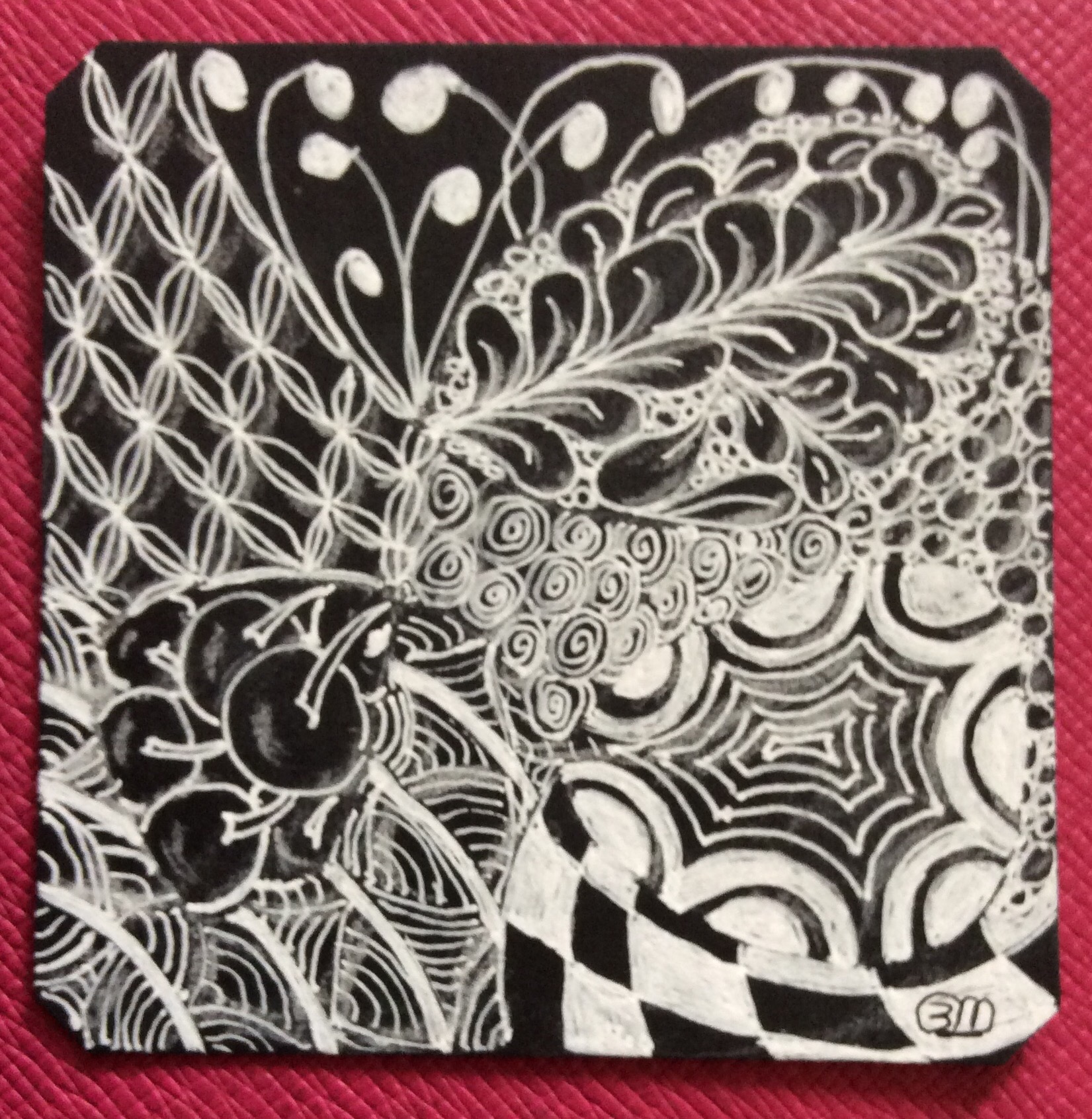
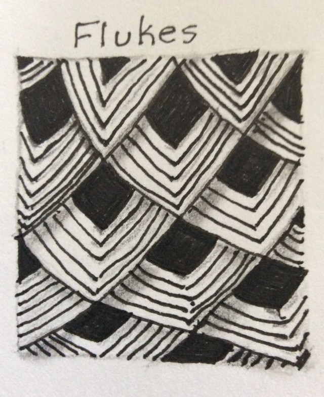
Why am I asking about reflected shadow? Well, as I was practicing the Zentangle pattern (more correctly, I suppose, called a tangle), it dawned on me that I could not just shade the Fluke tangle as recommended by the author of the book I am following, but that I need to use “reflected shadow” to give the piece greater dimension. This is not shadow or shade thrown by light shining directly at an object from a given angle; this is shadow that is picked up from objects or aspects of objects that are not put there by the light source.
Keeping in mind that I am neither artist nor talented anything, note that I added a touch of shade where the light source should be shining, a shadow that seems an integral part of the “layers” I envision as the pattern is drawn.
Notice that, in many cases, I have added a hint of shadow where the fine lines come together, and to the left of the tip of the filled-in square. I experimented with stacks of books and fanned papers to see how they appear when the light source should be spreading light under the “layers.” Instead of the absence of dark from the flowing light, there is what appears to be a reflection of the shadow “underneathe” the surface layer. Granted, this drawing is amateurish and in clear need of much practice; but I cannot escape the evidence of my experimentation, and feel compelled to add that reflected darkness to allow for a bit more dimensionality to my drawing.
Despite my newness to art in general and Zentangle in particular, I find that I am beginning to add my own embellishments–ones that seem more reflective of the real world–than my beginner’s and intermediate art “how-to” books describe drawing and painting. Perhaps the artists writing these books have so strongly incorporated certain observations and techniques into themselves and their work that such topics become too obvious to discuss.
An example of what I can only call entrenchment goes back to the days when I was a computer programmer who functioned as intermediary between the technical staff and the company managers and “users” of the final products. I would listen to the techs and would listen to the executives; then I would translate into language each group could understand that information the other group was attempting to convey. Maybe because I think in terms of pictures (my right-brain at work–see the post Bilateral Thinking) and then attempt to translate what I “see” into language (mostly left-brained work), well…maybe that was why I was reasonably successful as the go-between. I knew the language of both parties, and could speak in words and sentences comprehensible to all. It was years before I discovered this is a talent that not everyone has. So maybe the artists that write the art books are equally challenged in conveying information needed by the novice.
On the subject of writing, I suppose “reflected shadowing” is done with clues in mysteries, or insight into the thinking process of any book’s character. The story teller might point out a person listening in the bushes, or blatantly state that there certain events are are coming or newly introduced portents are soon to occur to shed light on the plot or event (and I don’t mind telling you that I really dislike “little did she know that an attempt n her life would end this speculation” type of thing). It is easy enough to simply ignore or skip over such devices while reading. Obvious clues are so incorporated into a piece of good artwork that even the most jaded art critic might miss a point that would be invaluable when called to the attention of a novice artist.
Probably someone, somewhere in the literature of art–whether paean, malicious critique, or helpful “how-to” book–someone has used and explained what I call reflected shadow. Surely I am not the first novice to have noticed that, in my ignorance of the massive literature and within the solace of my “how-to” books–I have missed any discussion of the opposite of reflected light: reflected shadow.
Keep light in your work, regardless how dark. Even a star on the horizon during a cloudy and moonless night gives us hope.
#educ_dr
18.050522
-63.130588

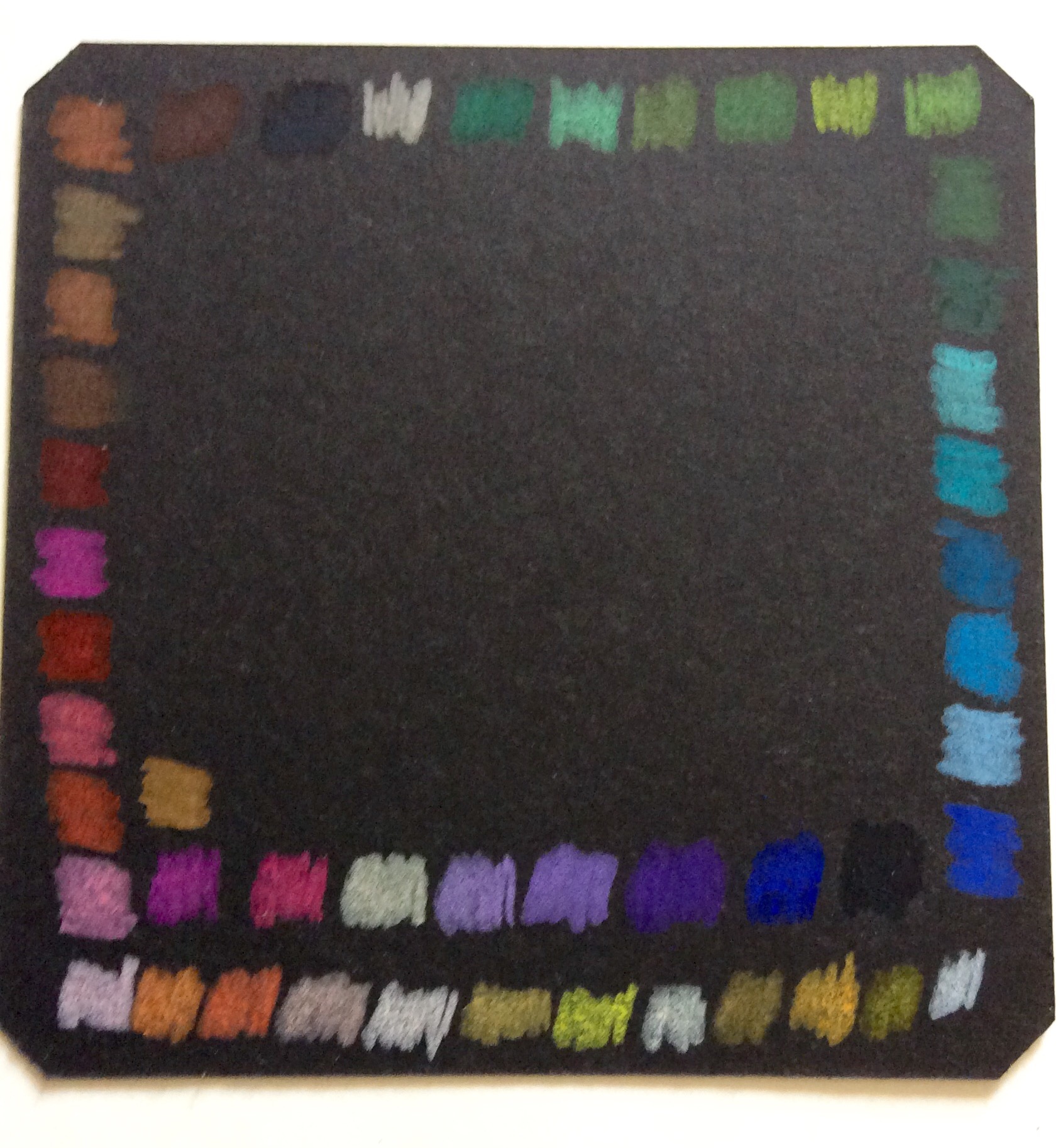 As I worked swatches of the Derwent Studio pencils, it was readily apparent that I had to press much harder and apply more layers to get close to the true colors. However, the end result looked pretty good on the black background. Just not as good as the Prismacolor Premier. I was expecting the Prismacolor Scholar colors to be just as wonderful as their professional counterparts. Well, see for yourself in the side-by-side tiles of the two student grade sets.
 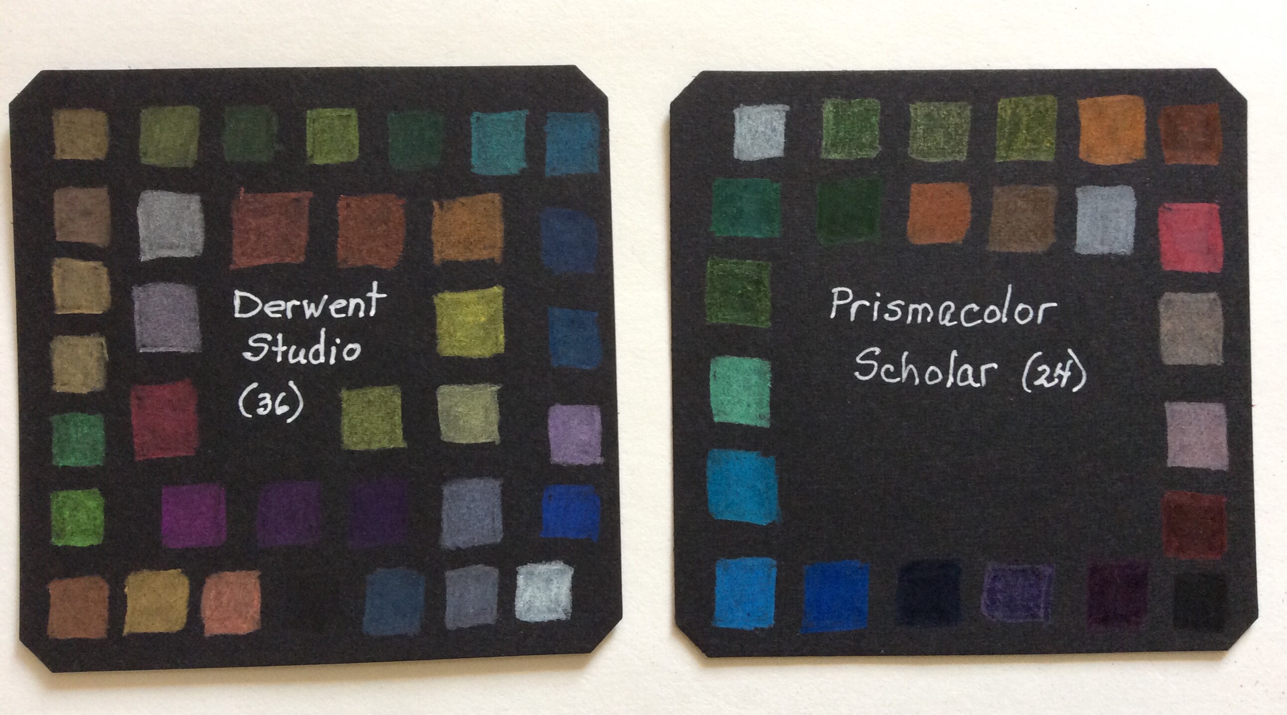 Pressure and coats was about the same for both student quality sets. Some of the Scholar swatches are brighter than their Studio counterparts, but proportionately fewer Scholar colors are clear and visible compared to Studio colors. Overall, the Studio colors tend to be more subdued than either of the Prismacolor matches. However, I really did not like working with the Scholar pencils, mostly because they are so waxy that I felt as though I were coloring with birthday cake candles. As for the subdued Studio colors, sometimes that is the preferred effect for a piece.